Next Chapter
Researching and building the design system for an e-book library manager, so that books pulled in from five different platforms finally look like they belong to one shelf.
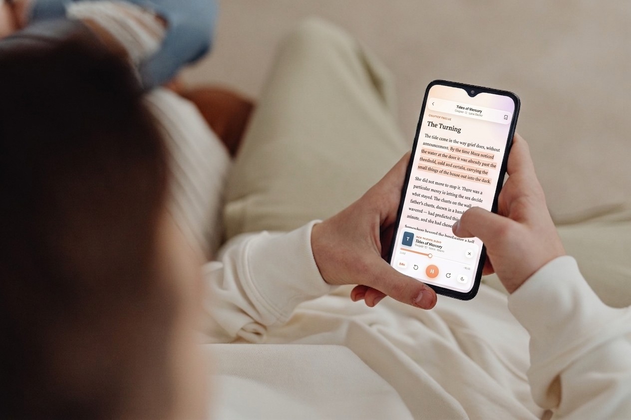
A reusable baseline the team could build from.
The system provided the baseline for onboarding new designers and maintained WCAG AA contrast standards across core components, so consistency and accessibility held without a designer reviewing every screen.
I researched the references, then built the system.
I was the only designer on the project, so the system was mine end to end: auditing the guidelines and e-book products we would be judged against, deciding the foundations, drawing every component in every state, and maintaining the sheet the two engineers built directly from.
An app that merges five sources shouldn't look like five apps.
Every imported book arrives with its own cover treatment, metadata shape and platform conventions. Without a system, each screen solves the same problems again: a third button variant, a fourth shade of grey, a progress indicator that behaves differently from the last one. The interface stops feeling like one library, which is the only thing the product promises.
Four passes, from reference systems to a working library.
Reading the platform guidelines
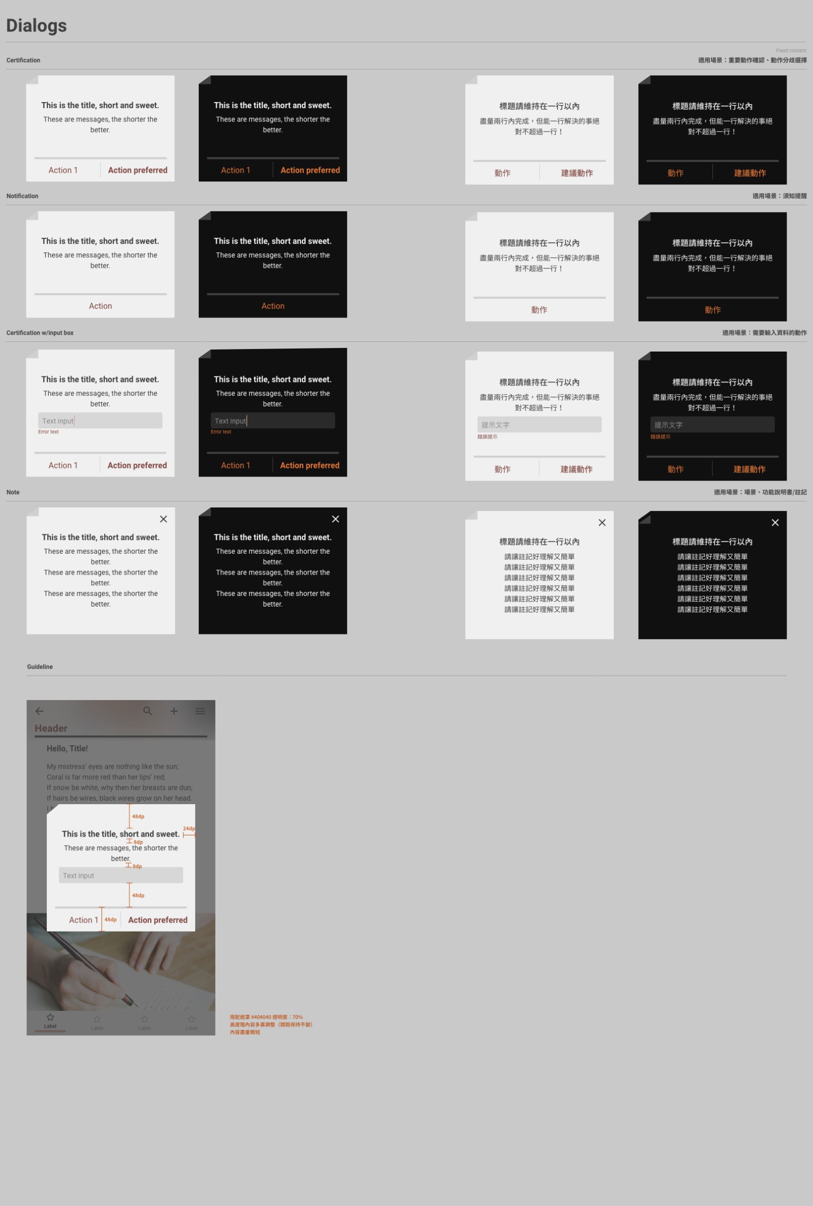
Material 3 and the iOS HIG pattern sheets, read side by side (R3 on the board). Material gave the hero → filter → list → CTA skeleton and the docked mini player; iOS gave one row height that absorbs every accessory and a share sheet ordered by frequency. Where they agreed (tap targets, contrast, one primary action per detail view), the rule went straight into our foundations.
Tearing down two e-book products
Calibre 9.13 on desktop and Kindle on e-ink (R1, R2). Calibre proved metadata depth is the differentiator: faceted counts and a live jobs channel make a large library knowable, but its toolbar and table cannot survive a phone. Kindle's home sells rather than serves; the patterns worth taking were the clipped carousel edge and the floating cover that resumes the current book.
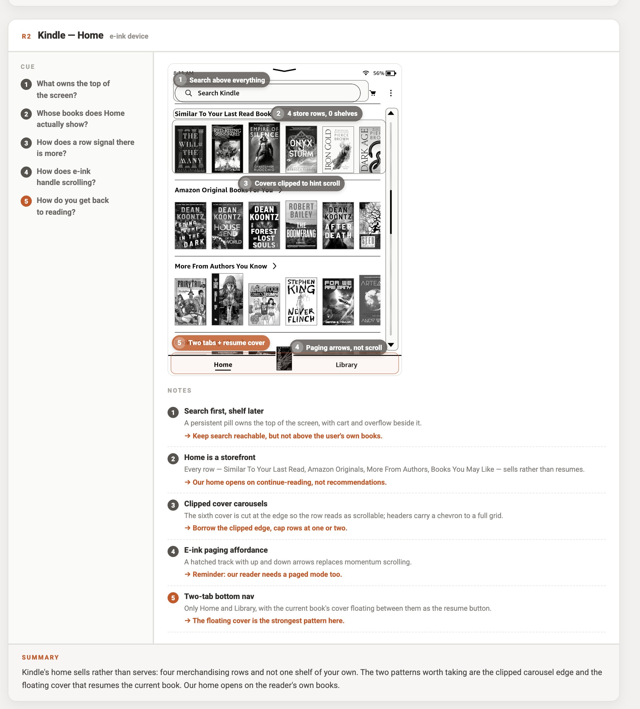
Counting what we already had
I screenshotted every existing screen and grouped the pieces by function rather than by page. Seventeen components turned out to be doing work that eight could do: that list became the first version of the library, and the argument for building it.
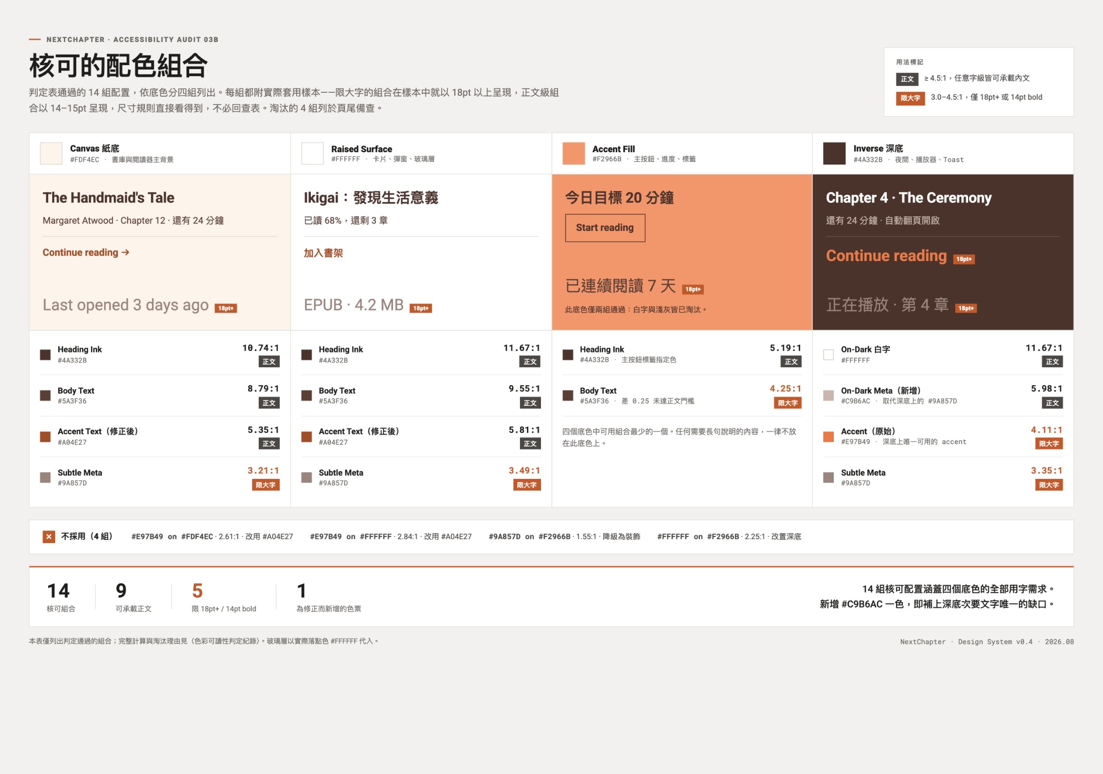
Testing the system, not the screens
I only measured the pairings that actually occur in the product, 17 of them, rather than filling a matrix for its own sake. Four failed outright and five turned out to be safe at 18pt but not at body size, which is exactly the distinction a swatch page hides.
Two fixes came out of it: the accent dropped 18% in lightness to #A04E27 so links and button labels clear 4.5:1 on both light surfaces, and one new token, #C9B6AC, filled the only real gap, secondary text on the dark reading surface.
Tap targets were then measured at 44px and three build-along sessions had an engineer assemble an unseen screen from the sheet alone. Round one failed: my token names described appearance rather than purpose, so "coral-500" became "accent-primary".

Nobody had a system for both halves of the job.
Two platform guidelines and three e-book products, scored on the same four criteria. The pattern was consistent: the systems that manage a library have no reading vocabulary at all, and the ones that read beautifully only style the books they sold you.
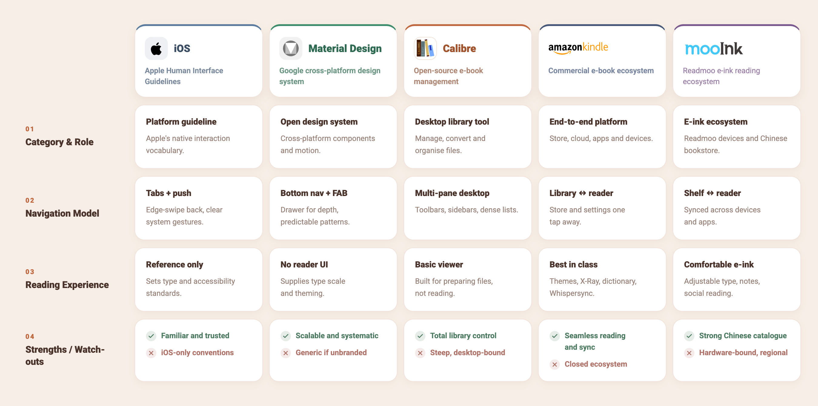
Library vocabulary and reading vocabulary are never in the same system.
Calibre specifies dense management UI with a basic viewer; Kindle and mooInk specify reading comfort inside a closed catalogue. Next Chapter's system needed both sets of components under one set of foundations.
A source-agnostic system has to be visually neutral.
Every commercial platform brands its own reading surface. Ours holds books from all of them, so the palette had to recede: paper, ink, one accent, and nothing that argues with a cover.
Borrow the conventions, spend the novelty elsewhere.
HIG and Material already set the gestures, tap targets and accessibility floor readers arrive with. Inheriting them meant the system only had to be original where it mattered: the shelving model.
Three findings that shaped the system.
Covers from five sources fought each other for attention on one shelf.
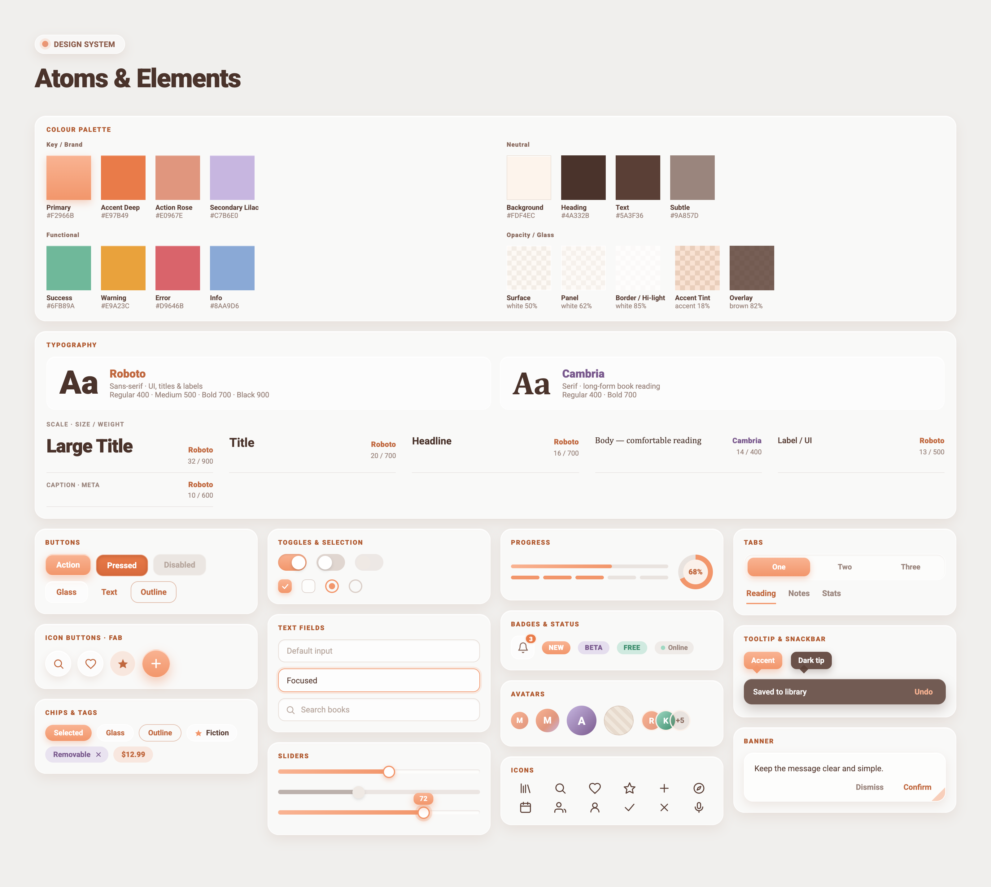
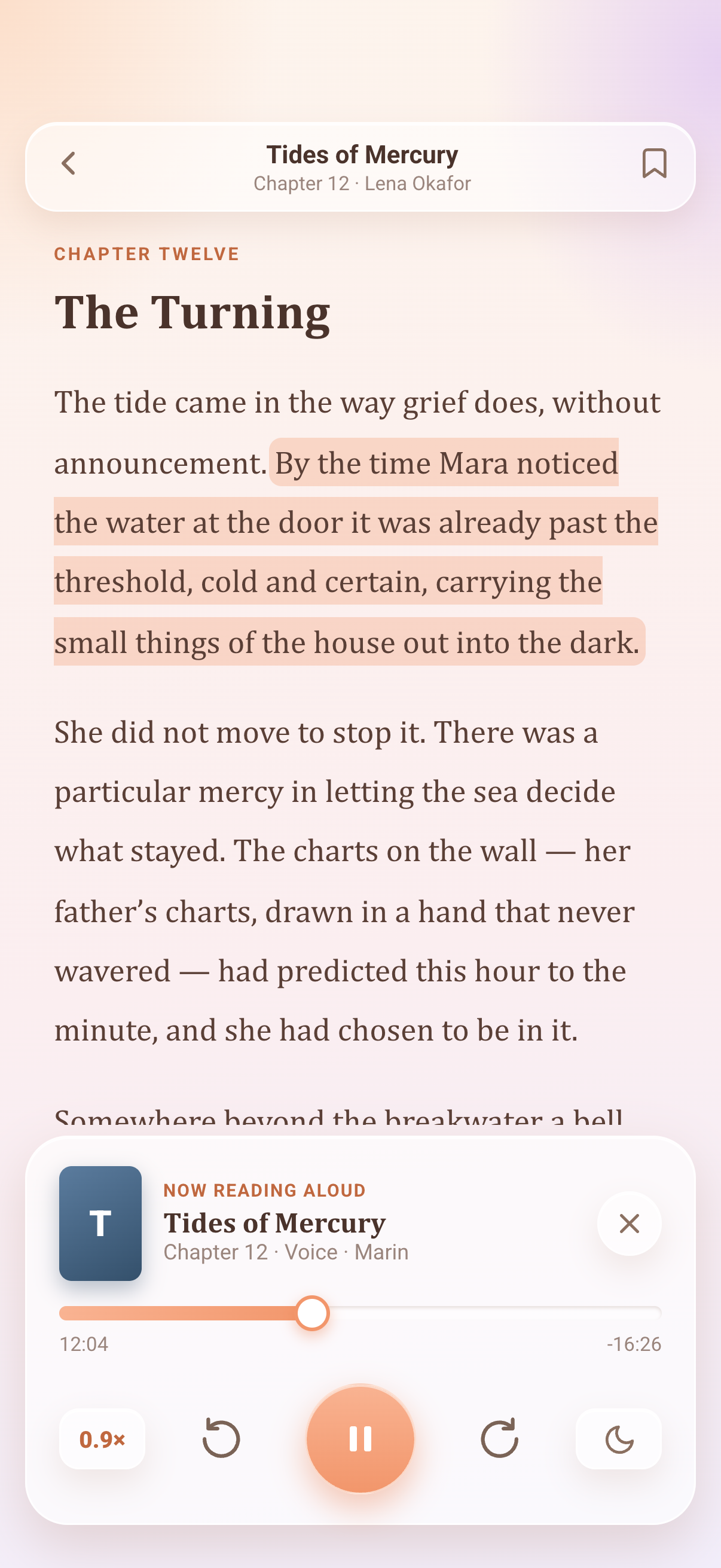
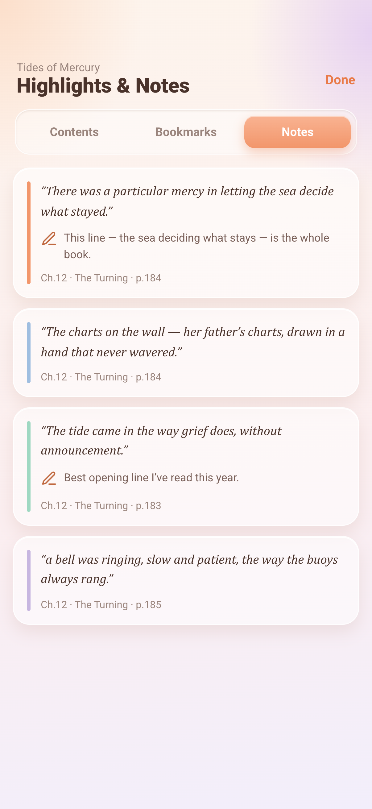
DecisionA warm paper background and one coral accent, so the UI never competes with cover art.
Interface type and reading type were doing different jobs with one typeface.
DecisionRoboto for interface, Cambria for long-form reading: two scales, one shared rhythm.
Engineers could see components but not their states, so they invented them.
DecisionEvery control ships with default, focused, pressed and disabled drawn on the sheet.
A warm paper palette with a single coral accent, Roboto for interface and Cambria for long-form reading, so that books from any source arrive looking like they belong together. Every control is specified in the states the engineers would need: default, focused, pressed, disabled.
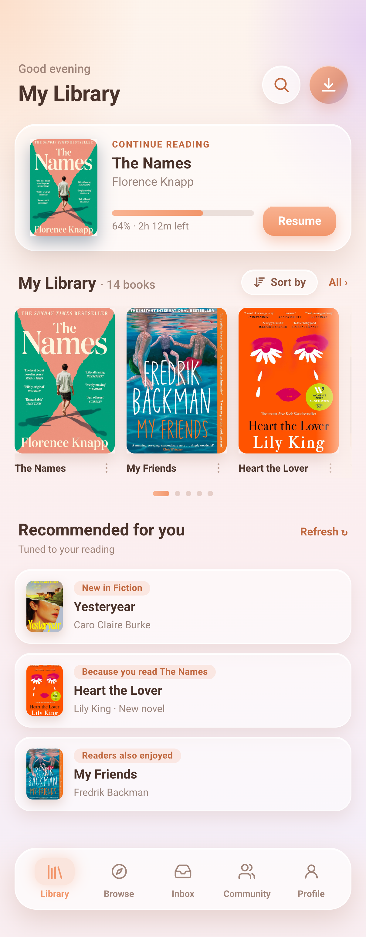
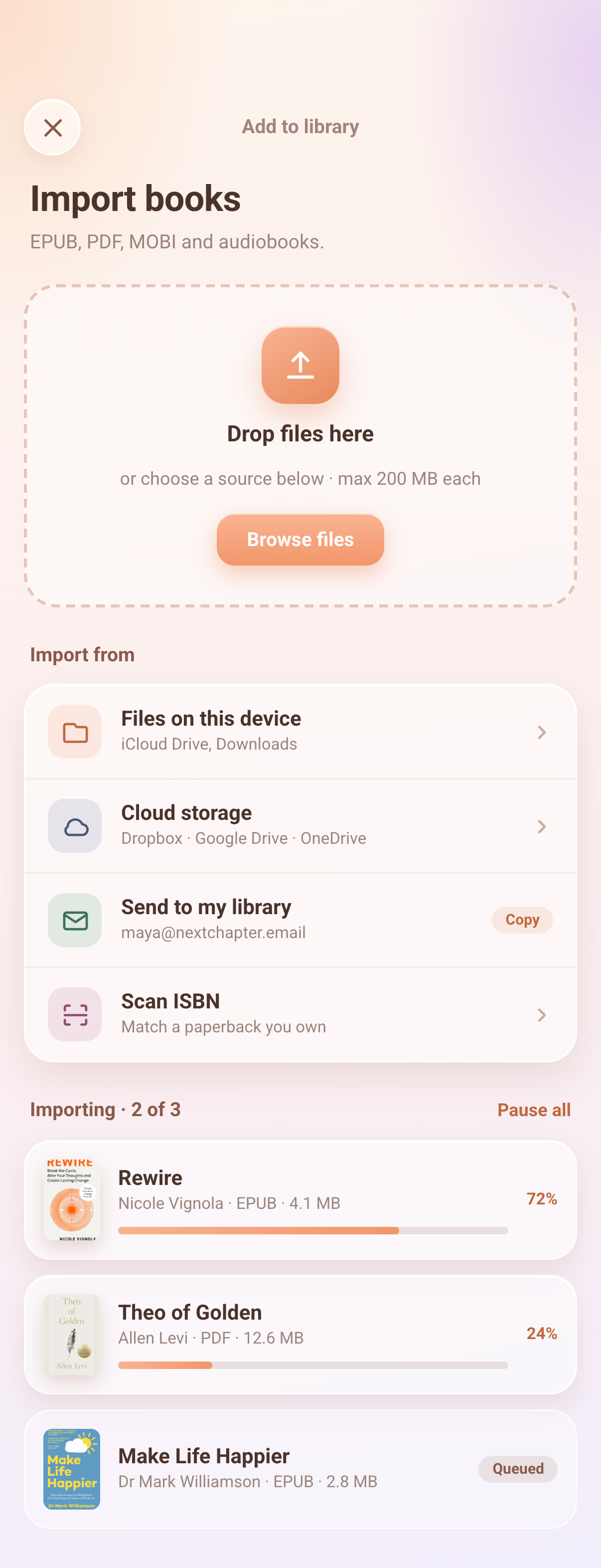
The system applied.
A system I can defend, but never got to prove.
NextChapter never launched, so the honest limit of this case study is that everything here was validated against rules and against the team, never against real readers. The contrast ratios hold, the components cover the states, and an engineer could build an unseen screen from the sheet alone. What I cannot claim is that any of it made the product better to use.
That gap changed how I think about validating a system. Internal checks confirm a system is consistent and buildable; only shipping tells you whether the decisions underneath it were the right ones. Next time I would put a small, imperfect version of the library in front of users far earlier, rather than perfecting a sheet that ended up being read only by the people who wrote it.
The lesson that did survive is about naming. Once tokens described purpose rather than appearance, people stopped asking me which grey to use, and I stopped being the bottleneck. That one holds whether or not a product ever reaches an app store.